
If you’ve been following along, you know RTS has been trying to apply a little design for the betterment of our transit system. RGRTA is currently studying the idea of new bus stop signs. And they’ve already introduced a better bus pass.
But wait, there’s more! RGRTA recently asked for our help redesigning one of the most important transit tools of all; those big, bad, bus schedules…
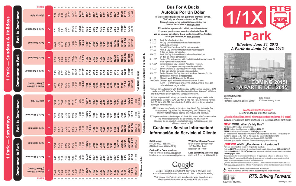
This was not going to be an easy job. Rochester’s bus schedules currently look like hideous word jumbles. And if you’ve ever tried to use them, you’ve probably thought to yourself, “Gee willikers! Riding the bus must be for people who are much smarter than me. I’d rather hitchhike.” But we’ve all seen what can happen when you hitchhike ![]() .
.
Relax. You don’t have to hitchhike.
Give your local graphic designer a hug 😀
Of course, no design job comes without its challenges. For starters, the old schedules had a TON of information, all of which must be conveyed in both English and Spanish. And because this is a quasi-government job (every penny stretched to the max) we were limited to a standard page size, flimsy paper stock, and initially just two colors! Although, we think we’ve managed to convince the powers that be to spring for a third color – as you’ll see represented here.
 We set out with one clear goal: Give the most experienced bus rider all of the information they need to keep moving, while making it friendly and appealing enough for a novice to want to pick up.
With the help of the volunteers at Reconnect Rochester ![]() , dozens of best-in-class examples were pulled from across the globe; NYC
, dozens of best-in-class examples were pulled from across the globe; NYC ![]() , Baltimore
, Baltimore ![]() , Santa Monica
, Santa Monica ![]() , Waukesha, WI
, Waukesha, WI ![]() , and as far away as Lisbon, Portugal
, and as far away as Lisbon, Portugal ![]() and Sydney, Australia
and Sydney, Australia ![]() . There was no need to reinvent the wheel here. We simply took the best from the best, and made a better one.
. There was no need to reinvent the wheel here. We simply took the best from the best, and made a better one.
First, we gave the old schedules a good scrubbing. All unnecessary fluff and marketing hype (“NEW!” “BUS FOR A BUCK!” “VISIT US ONLINE”) has been surgically removed and thrown out. All of those tiny edits afford us more space to add useful information, such as key route destinations on the cover, and a bigger, more detailed map.
Bigger maps may not seem important, but if you’re traveling to an unfamiliar neighborhood, you might want to know how far of a walk you’ll have from your stop to your final destination. In this situation, the old schedule maps weren’t very useful.
Here’s what the new design looks like (click for a larger view)…

We also made space for something most people don’t think about – empty space! In the world of information design we call this “negative space,” but it’s actually quite a positive thing. With a little extra breathing room around important bits of information, your eyeballs won’t have to work so hard, and your brain can process the information faster. And when you’re on the move, trying to catch a bus, that time and effort you save trying to decipher the schedule can be critical.

In general, every effort has been made to keep things simple. As an example, timetables that are very similar to each other might be merged. Route 52 (shown above) has a very similar schedule during the week and on weekends with only a few extra stops during the week. So instead of two separate timetables for Weekday AND Weekend, we can merge these into one table. Weekday-only stops are simply denoted with an asterisk.

We also redesigned a few of the major college brochures (Geneseo, Nazareth, etc.). Here, we realized we were targeting a key demographic – much younger, car-less and completely unfamiliar with Rochester. So these brochures got full color and a few extra panels with some info on local sites and relevant destinations.
Of course, it remains to be seen if RGRTA will roll out these new designs across all the bus routes. So far only the new Route 52 and the college brochures have been blessed. Baby steps.
These are fantastic! I think the most important thing you’ve introduced is *context*. So few bus maps have any! I’m a freaking geographer and I can’t tell where each bend and squiggle is in the real world without a little help 😉
The 52 in particular is just beautiful. I’m sure you could have cluttered it up a bit with more landmarks and make it a bit more contextualized, but really, as it is, the attraction people will have for something that looks so simple may be more important. I’m glad you gave it some room to breath too and included downtown as a reference point. You so easily could have cut it in half.
Thanks Nate! We agree. It sure is tempting to fill every available space. It’s almost counter intuitive – the more info that gets jammed in there, the more useless it becomes as a tool.
Love the 52 schedule. Would love to see these rolling out for all the routes.
We need to make the whole transportation process easier like making connecting to other buses more available throughout Rochester instead of having to go Downtown to catch a connecting bus.
Also bus pass purchase stations at bus stop locations…
Send me mail routes for 124 24. 23 and 83 mail